Many of the products shown in this post were generously donated by Close to My Heart. All opinions expressed herein are mine.
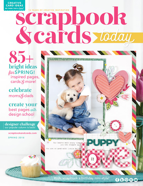
Did you know that when Scrapbook and Cards Today Magazine picks a cover they have three options to choose from? They ask three designers to create a layout with the same photo and journaling, and then they let each designer create something in his or her own style. This gives the magazine the opportunity to feature different styles and designers. I get so excited when I get to participate in this challenge. It's one that always stretches me a bit. Keep reading to see the layout I created and then see the cover they selected.
For this layout, I loved the soft colors in the photo so I used several items from Close to My Heart to create a feminine, layered layout. I love how this turned out, and I'll be honest; it took me several tries to get it to where I actually loved it. That's what I mean: challenging! If you love this layout, be sure to pin your favorite images.
The cover they selected is by the fabulous Nicole Nowosad, and I can see why. I mean that gingham title, right? So gorgeous. I'm a huge fan of Nicole's work.
If you'd like to download or purchase a hard copy of this issue, check out all the details HERE. You won't be disappointed. It's an incredible issue.


This is gorgeous!!!
ReplyDelete