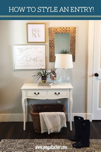
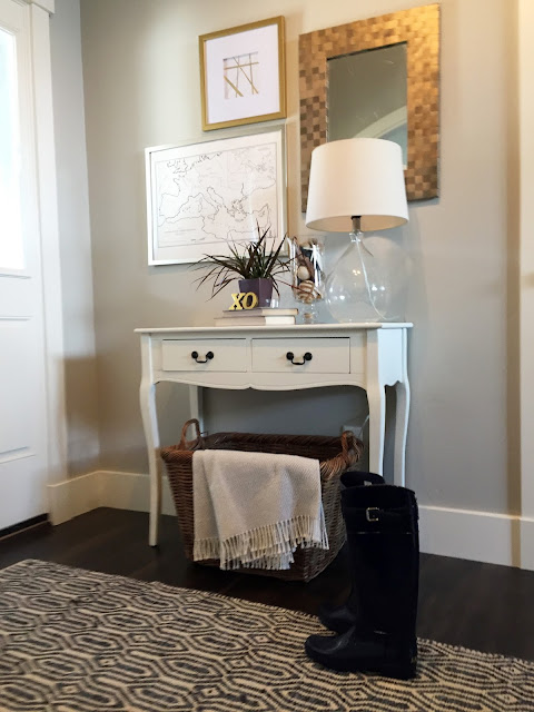
One of the first places that greets your guests is the entryway in your home. What kind of feeling do you want to present as guests walk through your front door? For me I wanted to introduce the soothing feeling I'm trying to carry through my home but also keep it light and simple. Here's a few tips for easily updating the entry in your home:
1. Watch the scale. I first placed the metallic mirror on the table and realized it was much too small for the space. So I filled in the space with a vintage map I found at an antique store and a gold framed piece from Hobby Lobby.
2. Go bigger on the rug. I've always had a puny little rug for my guests to enter and wipe their feet. But because this entry in our new home is more closed off, I realized I needed to go with a 5" x 7" rug instead. When I found this gorgeous rug at HomeGoods, I knew it was exactly what I needed.
3. Provide a place for dirty shoes. I added a wicker basket that I've had for years underneath the white console table from HomeGoods. I added a blanket for texture to the basket but in the wetter months, I can remove the blanket and store boots, wet shoes, and even flip flops in the basket.
4. Keep things simple. I wanted this space to feel light and airy so I used a clear glass lamp from Target which helps to illuminate the space on darker days. I then added a glass vase filled with blue and tan shapes, a spiky plant, and two gold letters that spell out "XO" from Hobby Lobby. Create different levels with items like vintage books.
5. Bring in the green. Plants can make a space feel alive. Pick a plant that fits your design style: large leafed for a more traditional look, fig leaf for a more modern look, succulents or spiky plants for a more earthen look. One plant can take a space from ho-hum to warm and inviting.
What's next?
We plan to update the lighting here and replace the dated entryway light with something a little more special. I haven't found something that speaks to me yet so for now, we're sticking with what we've got.
Sources:
- Paint: Revere Pewter from Benjamin Moore
- Metallic Mirror: Pier 1
- Gold Square Frame and Art: Hobby Lobby
- Silver Frame: Michael's
- Vintage Map: Antique Store
- Glass Lamp and Linen Shade: Target
- Glass Vase: Craft Store
- Botanicals in Jar: TJ Maxx
- Books: Vintage
- XO: Hobby Lobby
- Plant: Lowe's
- White Console Table and Rug: HomeGoods
- Wicker Basket: I've had for years
- Blanket: Tuesday Morning


My hallway is a long dark and narrow space. I tried my best to keep the shoe cabinet as pretty as possible but it always become that space where all the junk end up piling up :-) What we did to brighten the space is take family pictures in black and white. In each picture we hold a different letter to spell the word Welcome. I printed each of them, pasted them on light blue hard paper and taped them to the wall in order. The 7 pictures to spell welcome are filling the empty length of that long narrow space nicely.
ReplyDeleteCynthia, that is an AWESOME idea and a great way to make a welcoming entrance and highlight family photos. LOVE it!
Delete